| View previous topic :: View next topic |
| Which cover for the Medical Sourcebook? |
| https://docs.google.com/file/d/0B7hbaKpCdGGkTlZYUnlsZHpPcUczdDJld29PV3ltcEtEXzN3/edit (by KeldorKatarn) |
|
5% |
[ 1 ] |
| https://docs.google.com/file/d/0B7hbaKpCdGGkbndGcjd1SGtxbE0/edit (by TyCaine) |
|
35% |
[ 6 ] |
| https://docs.google.com/file/d/0B7hbaKpCdGGkTjgyZjZZdGkxZUk/edit (by TyCaine) |
|
41% |
[ 7 ] |
| Another option entirely... |
|
17% |
[ 3 ] |
|
| Total Votes : 17 |
|
| Author |
Message |
TyCaine
Captain

Joined: 16 Oct 2009
Posts: 515
Location: Florida, US
|
|
| Back to top |
|
 |
garhkal
Sovereign Protector


Joined: 17 Jul 2005
Posts: 14359
Location: Reynoldsburg, Columbus, Ohio.
|
 Posted: Wed Jul 02, 2014 4:26 pm Post subject: Posted: Wed Jul 02, 2014 4:26 pm Post subject: |
 |
|
YAY.. I see you took my suggestion to make this a poll! I wonder if the powers that be on the SWRPGNETWORK holonet, would have an issue with this getting cross-posted there.
_________________
Confucious sayeth, don't wash cat while drunk! |
|
| Back to top |
|
 |
cheshire
Arbiter-General (Moderator)

Joined: 04 Jan 2004
Posts: 4866
|
 Posted: Wed Jul 02, 2014 10:36 pm Post subject: Posted: Wed Jul 02, 2014 10:36 pm Post subject: |
 |
|
I'm fighting between 2 and 3. I like the GENERAL design of #1, but the focus of the picture is... well... a little off.
Actually the focus is on Luke's bulge. Kinda not the thing you want to call front and center when you're proposing cybernetic enhancements.
_________________
__________________________________
Before we take any of this too seriously, just remember that in the middle episode a little rubber puppet moves a spaceship with his mind. |
|
| Back to top |
|
 |
Raven Redstar
Rear Admiral


Joined: 10 Mar 2009
Posts: 2648
Location: Salem, OR
|
 Posted: Thu Jul 03, 2014 1:49 am Post subject: Posted: Thu Jul 03, 2014 1:49 am Post subject: |
 |
|
I like aspects of several.
I agree with cheshire, that the resolution for the picture seems a bit off to me. I like the background cover of Keldor's, but the font seems a little off. I also did not notice Luke's man bulge until your mentioned it.
If I could do it any way, I would take the layout & background of Keldor's with the 21-B picture from Ty Caine's, and the font from Ty Caine's. That to me would look the closest to an "Official" source book cover.
I liked the Hyperfield Starscape for the one you did, but for the medical book it just feels too busy. I think doing the solid color cover is the way to go for this book.
_________________
RR
________________________________________________________________ |
|
| Back to top |
|
 |
DougRed4
Rear Admiral


Joined: 18 Jan 2013
Posts: 2295
Location: Seattle, WA
|
 Posted: Thu Jul 03, 2014 5:21 pm Post subject: Posted: Thu Jul 03, 2014 5:21 pm Post subject: |
 |
|
My thoughts were exactly the same as cheshire (so I laughed when I read it after voting for #2). 
_________________
Currently Running: Villains & Vigilantes (a 32-year-old campaign with multiple groups) and D6 Star Wars; mostly on hiatus are Adventures in Middle-earth and Delta Green |
|
| Back to top |
|
 |
KeldorKatarn
Ensign

Joined: 05 Feb 2012
Posts: 48
|
 Posted: Thu Jul 03, 2014 5:26 pm Post subject: Posted: Thu Jul 03, 2014 5:26 pm Post subject: |
 |
|
Okay I see.... Ty Caine....please delete my entry  |
|
| Back to top |
|
 |
DougRed4
Rear Admiral


Joined: 18 Jan 2013
Posts: 2295
Location: Seattle, WA
|
 Posted: Thu Jul 03, 2014 6:02 pm Post subject: Posted: Thu Jul 03, 2014 6:02 pm Post subject: |
 |
|
Hey, your image is still good work. Far better than anything I could do!
_________________
Currently Running: Villains & Vigilantes (a 32-year-old campaign with multiple groups) and D6 Star Wars; mostly on hiatus are Adventures in Middle-earth and Delta Green |
|
| Back to top |
|
 |
aegisflashfire
Commander


Joined: 24 Mar 2014
Posts: 298
Location: Cincinnati, OH
|
 Posted: Thu Jul 03, 2014 10:06 pm Post subject: Posted: Thu Jul 03, 2014 10:06 pm Post subject: |
 |
|
I think I would like a collage style image for the sourcebook more than just a square image. The hyperspace background feels like a bit of a cop out and doesn't fit stylistically with the other sourcebook covers.
Maybe the medical frigate, bacta tank, 2-1B, FX droid, etc.
(something more like this)
[spoiler]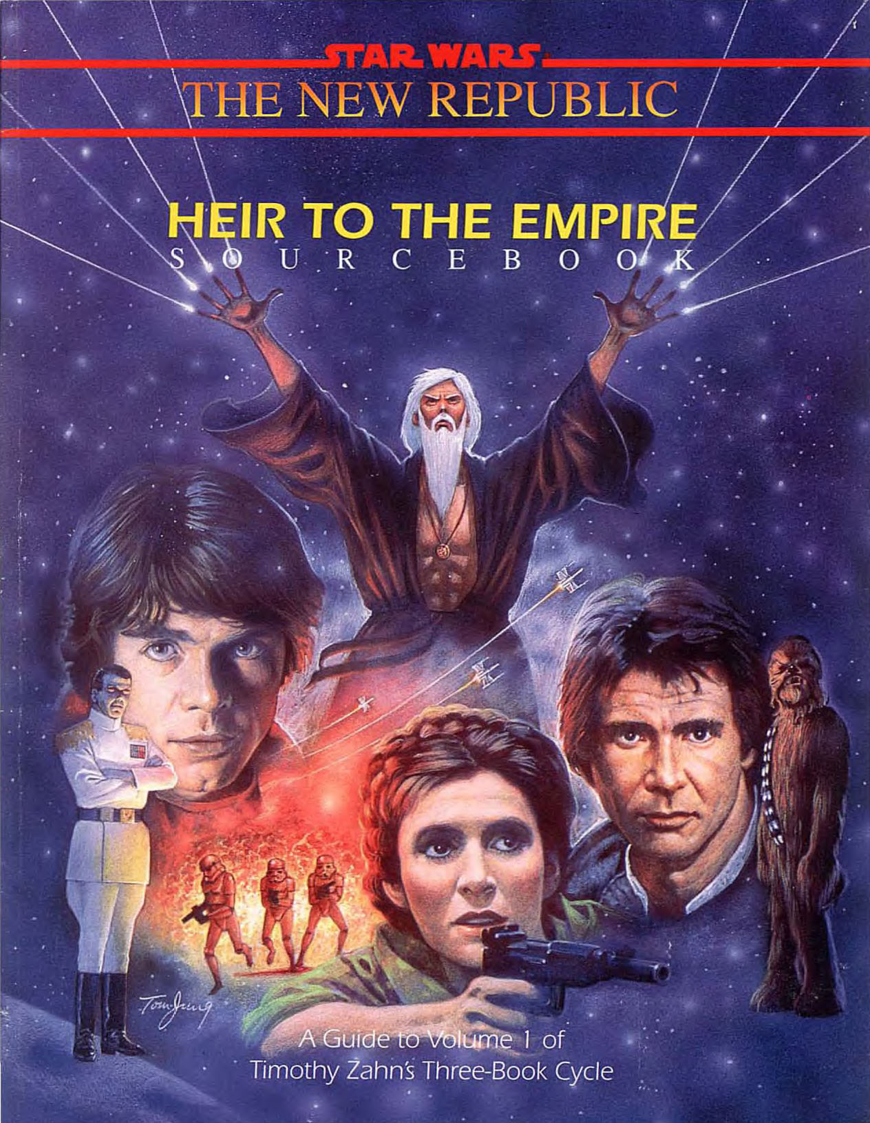 [/spoiler] [/spoiler]
of course, that's one of those 'who's going to bell THAT cat' given the difficulties and complexity of doing a collage style cover.
_________________
http://swfallingstar.podbean.com
GM of Falling Star: D6 Star Wars Campaign Podcast |
|
| Back to top |
|
 |
TyCaine
Captain


Joined: 16 Oct 2009
Posts: 515
Location: Florida, US
|
 Posted: Thu Jul 03, 2014 10:29 pm Post subject: Posted: Thu Jul 03, 2014 10:29 pm Post subject: |
 |
|
Depends on which sourcebooks you're looking at, some of the second edition are solid color covers with a single picture in the middle (example: Imperial Sourcebook solid black, Rebel Sourcebook solid white) or color gradients with a single picture in the middle (most of the second edition Galaxy Guides), or pictures that cover the entire front cover (Platt's Smugglers Guide, Rules of Engagement).
There's a lot of diversity between the covers...
As for the starfield, that was something that was thought of for one or two of the fan books put together by the G+ Community (myself included), so I just went with it as kind of the latest generation of fan made books, keeping things in the same theme.
Can I change out the starfield for a solid color or gradient, or do a full cover image to match the bulk of the sourcebooks? sure, easily enough done.
Can I do a collage...? maybe, as you mentioned not as easily done, after all the image you showed was a collage crafted together as a single image at time of creation, 'easier' than trying to mash disparate images together after the fact.
Either way Keldor and myself put out images for Luwingo to use if he wanted, and we're willing to tweak if needed. if anyone else can do better, then that's great too as our primary goal is for Luwingo to have an image he is happy with for the sourcebook he worked so hard on.
so, cop out? not really... but everyone's entitled to their opinion...
T.C.
_________________
"For every person with a spark of genius, there are a hundred with ignition trouble." |
|
| Back to top |
|
 |
aegisflashfire
Commander


Joined: 24 Mar 2014
Posts: 298
Location: Cincinnati, OH
|
 Posted: Thu Jul 03, 2014 10:35 pm Post subject: Posted: Thu Jul 03, 2014 10:35 pm Post subject: |
 |
|
cop out is the wrong phrase. I think I just prefer a stationary star field background.
_________________
http://swfallingstar.podbean.com
GM of Falling Star: D6 Star Wars Campaign Podcast |
|
| Back to top |
|
 |
CRMcNeill
Director of Engineering


Joined: 05 Apr 2010
Posts: 16406
Location: Redding System, California Sector, on the I-5 Hyperspace Route.
|
 Posted: Fri Jul 04, 2014 12:55 am Post subject: Posted: Fri Jul 04, 2014 12:55 am Post subject: |
 |
|
Of the three options, I prefer Keldor's center photo choice, but I like TyCaine's background / border choice.
_________________
"No set of rules can cover every situation. It's expected that you will make up new rules to suit the needs of your game." - The Star Wars Roleplaying Game, 2R&E, pg. 69, WEG, 1996.
The CRMcNeill Stat/Rule Index
|
|
| Back to top |
|
 |
Dromdarr_Alark
Commander


Joined: 07 Apr 2013
Posts: 426
Location: Boston, MA
|
 Posted: Fri Jul 04, 2014 12:14 pm Post subject: Posted: Fri Jul 04, 2014 12:14 pm Post subject: |
 |
|
I agree that I think a static starfield would be more appealing than a hyperspace zoom (it just seems too busy).
What I think would be fun is to have all the rancorpit sourcebooks have the same aesthetic but with a different image. In this case, they would all have the same background and font, but different image.
_________________
"I still wouldn't have a roll for it - but that's just how I roll." |
|
| Back to top |
|
 |
DougRed4
Rear Admiral


Joined: 18 Jan 2013
Posts: 2295
Location: Seattle, WA
|
 Posted: Fri Jul 04, 2014 6:16 pm Post subject: Posted: Fri Jul 04, 2014 6:16 pm Post subject: |
 |
|
Add me as another that would prefer a more static starfield, if it's not too much trouble to change it (or to make a solid background).
I also concur with Dromdarr, that it might be cool to have a similar aesthetic for all Rancor Pit books.
_________________
Currently Running: Villains & Vigilantes (a 32-year-old campaign with multiple groups) and D6 Star Wars; mostly on hiatus are Adventures in Middle-earth and Delta Green |
|
| Back to top |
|
 |
TyCaine
Captain


Joined: 16 Oct 2009
Posts: 515
Location: Florida, US
|
 Posted: Fri Jul 04, 2014 6:31 pm Post subject: Posted: Fri Jul 04, 2014 6:31 pm Post subject: |
 |
|
I have this template as a Photoshop PSD file, so it's easy enough to change out, and I can also create more covers if people want or need them using the same template and different center images so that we all have the same style.
If others don't want to go through the trouble of creating their own obviously. 
So is there a consensus?
Solid color? which color?
Static starfield? Anyone have an image they'd like to see?
And for the Medical book, what's the take on that one?
T.C.
_________________
"For every person with a spark of genius, there are a hundred with ignition trouble." |
|
| Back to top |
|
 |
Dromdarr_Alark
Commander


Joined: 07 Apr 2013
Posts: 426
Location: Boston, MA
|
 Posted: Sat Jul 05, 2014 1:09 am Post subject: Posted: Sat Jul 05, 2014 1:09 am Post subject: |
 |
|
I'd like to preview a the same covers that have the hyperspace field, but with a star field instead.
_________________
"I still wouldn't have a roll for it - but that's just how I roll." |
|
| Back to top |
|
 |
|


